5 Ways Web Designers Can Perfect Their Elevator Pitch

5 Ways Web Designers Can Perfect Their Elevator Pitch

For web designers who have read the title and wondering what an elevator pitch is, here is an explanation. Unfortunately, we cannot give credit to anyone for first using the term “elevator pitch” because there are numerous names suggested as to who was the first person to use it, and the list includes an elevator safety device inventor, journalists, authors, and a telecoms technician.

However, what is not in dispute is the definition of an elevator pitch which is how you would try to advocate a product or service to someone in an elevator, with the main constraint being that most elevator rides take no longer than 30 seconds to 60 minutes on average. In other words, your elevator pitch has to be concise.

So, have you ever considered how you would pitch your web design services to a person beside you in an elevator, and could you deliver that pitch in the time that the elevator takes to complete its ascent or descent? What you must appreciate is an elevator pitch is not just for pitching your services when in an elevator, but in all circumstances and locations where you only have a short time to explain what you do and how it can benefit the person you are talking to.

An excellent elevator pitch can be an extremely useful tool for you to promote your web design skills and services to people you meet in all sorts of places such as a bar, a restaurant, an aircraft, a train, or simply standing in a queue at the bank. The opportunities are limitless, but even so, they will be for nothing if your elevator pitch is poor. That is why we have outlined 5 ways you can make your elevator pitch as close to perfect as it can be.

(more…)

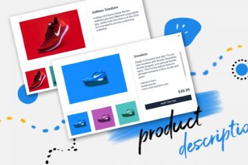
Product Images And Descriptions

What Ways Can The Product Images And Descriptions Be Optimised On My Website?

When it comes to on-site optimisation, images are one of the most missed opportunities and one which many website owners get completely wrong with regards to SEO.  What you need to be aware of is that when Google crawls a website, its spiders do not see images, only text.

For example, if you were a local dog groomer, and had an image of a beautifully groomed German Shepherd on your website as an illustration of your great grooming skills, if that image file was simply called ‘image1’, that is what Google takes it to be; image number 1. It doesn’t see a German Shepherd; in fact, it doesn’t see a dog at all.

Now, if you name the image file ‘German-Shepherd’ and upload it to your website, Google will see those words, and better still is if you utilise the alt-text function. Alt-text is what you might see on your screen if your mouse hovers over an image, but more importantly, it is what Google’s spiders send back when they come across an image.

(more…)

Accessible Business

Top Tips For Choosing The Right Font Pairings For Your Website

Although web design is a complicated and time-consuming process, it can be broken down into smaller steps to make it easier. One of the most important of these steps is defining your brand.

As you might already know, your brand image is essentially your online persona, and it’s closely related to the way people perceive you and your website. It can be influenced by things like your overall design, colour schemes, font pairings and more.

Font pairings and selection is one of the most important parts of the entire web design process, but it’s one that we don’t often talk about. Because of this, I decided to put together a list of a few tips to help you choose the perfect fonts for your new website.

  1. Think About The Message You’re Trying To Convey

Although you might not realise it, different fonts can be extremely effective to convey different messages. Some websites are best with more serious fonts, while others work well with fun or creative styles.

For example, if you’re building a new small business website for your up and coming law firm, you will want to build a professional image. In this case, it would be best to use serious, somewhat boring fonts.

On the other hand, entertainment or social type sites are often better suited to more creative fonts. Depending on your overall design, you might decide to use a font which really stand out at unique.

(more…)

How to Design For People Who Use Mobile

Mobile devices have become the primary gateway to the internet. More people access websites via smartphones than through desktops or laptops. This shift in user behavior makes it essential for creative design services to optimize mobile-friendly designs. When crafting your web presence, it’s crucial to optimize for mobile users who rely on their phones to research companies, make purchases, and browse the web.

To ensure your designs cater effectively to mobile users, consider the following key areas:

Simplicity

Remember that the person who is looking at your web design is going to be on mobile, which means simplicity is king. Take away anything that isn’t strictly necessary or anything that will make load times faster. Think about the necessities of your design, including the logo, contact information, store locator, and key information that the person is probably looking for.

Keep the blocks of text and huge images for the desktop websites. When possible, use things like lists or drop-downs to avoid large amounts of text.

Layout

Mobile is slower than traditional internet, so you have to keep the website streamlined and easy to use. If someone can’t load the page, they have to look around too much, or they can’t seem to find the right place to go, they will quickly click back and go to another page.

(more…)